| Table of Contents | ||||
|---|---|---|---|---|
|
Why do we need this?
Originally developed for screen sizes upper than 9’’
Doctors have been using it on their mobile phones
Few of the screens were broken on mobile phones making it difficult to use
Doctors who are frequently mobile, need better rendered screens/modules on smaller screen sizes.
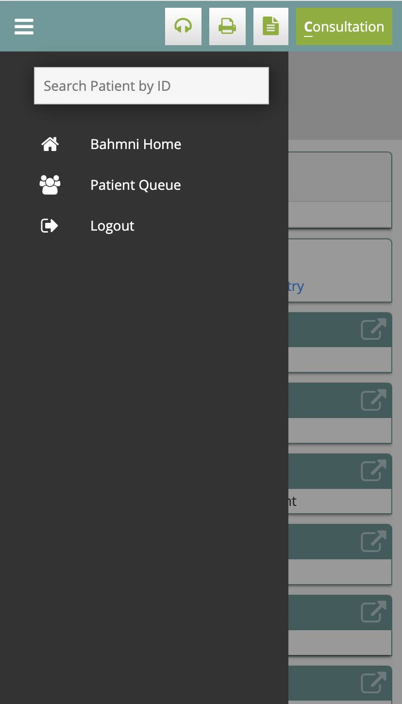
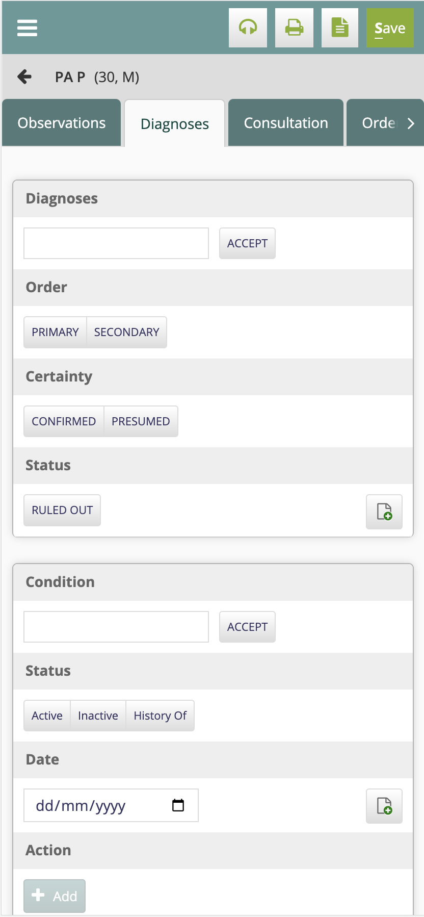
We have identified key areas(Clinical module) to be fixed, which provides a better experience for doctors and eases the use of Bahmni on mobile.
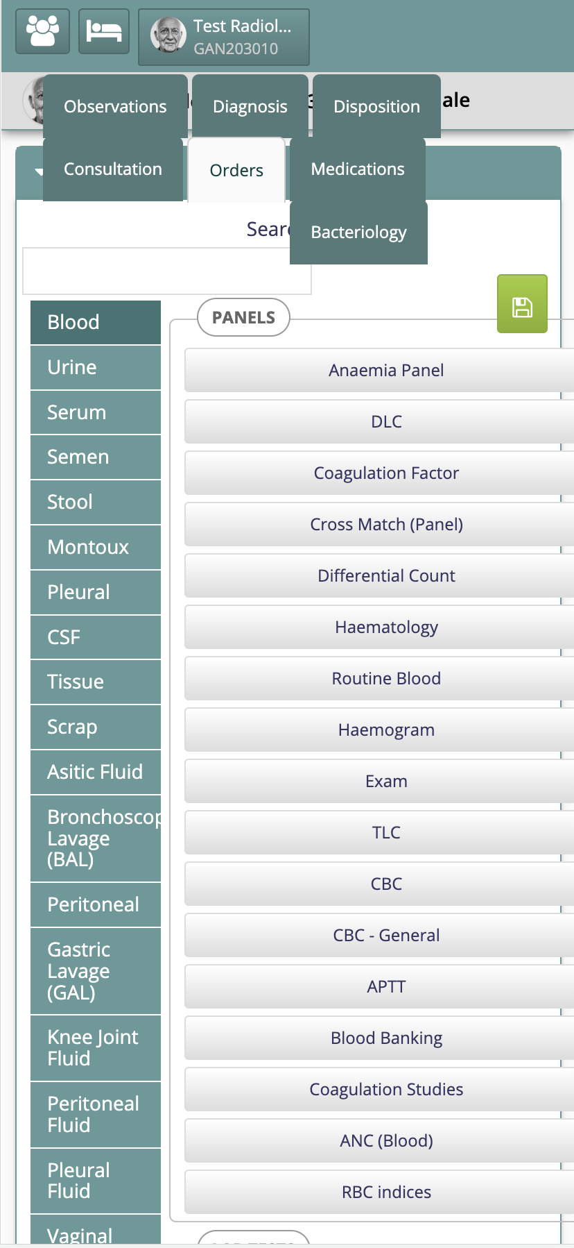
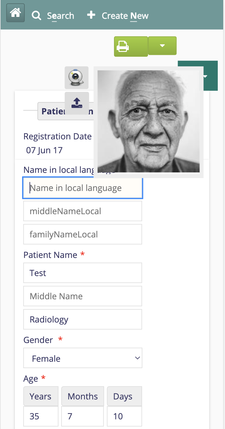
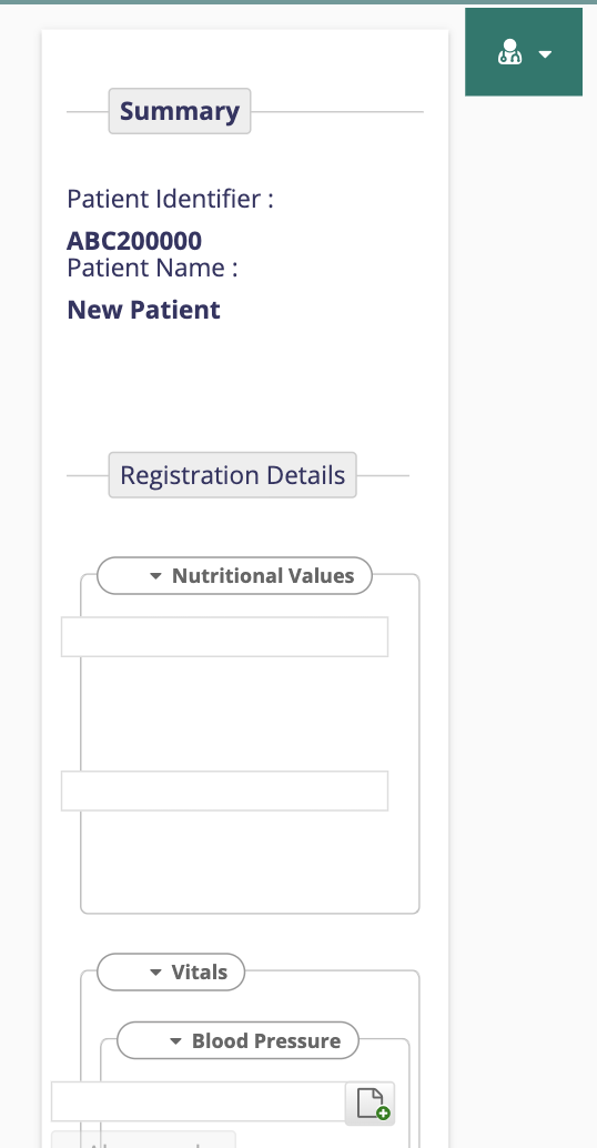
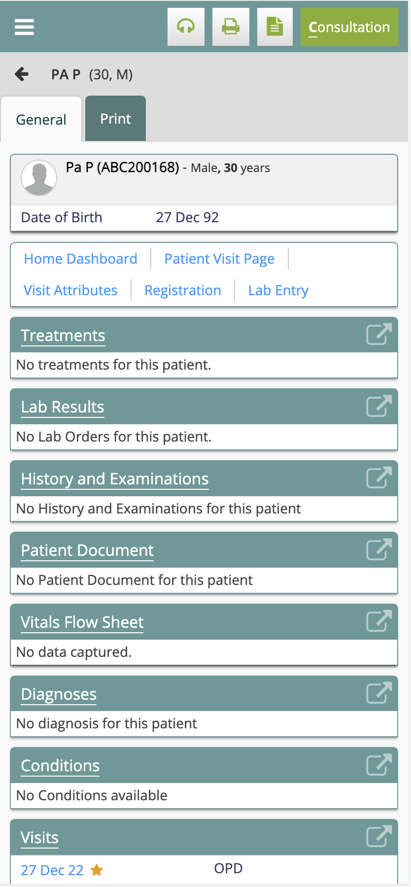
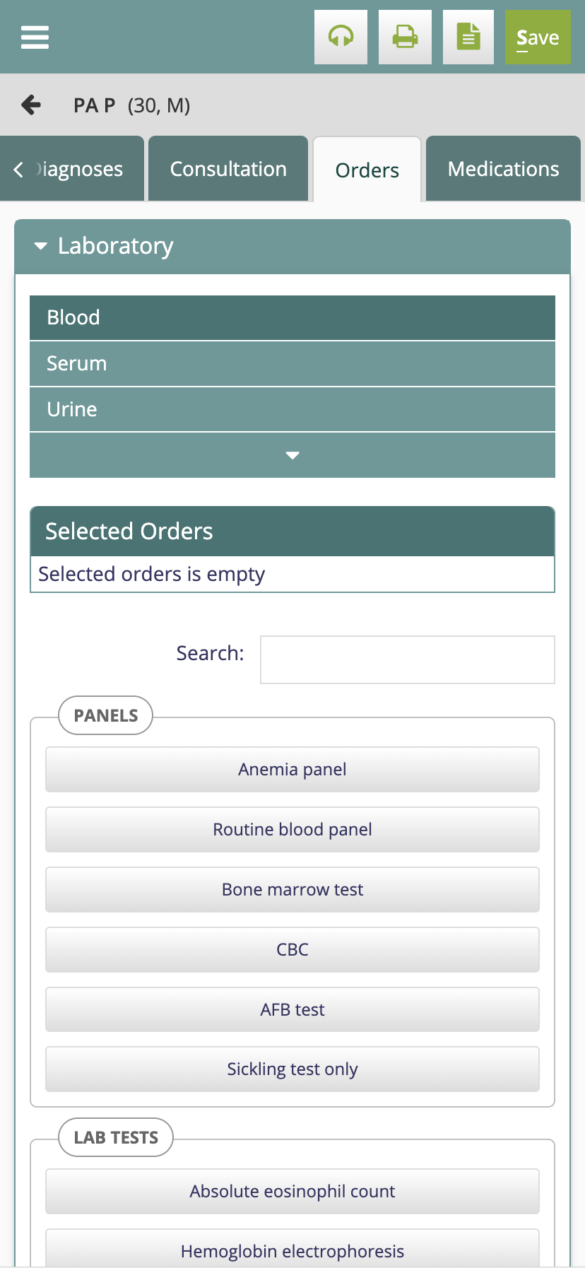
How bad was it?
| Panel | ||
|---|---|---|
| ||
Clinical |
| Panel | ||
|---|---|---|
| ||
Registration |
What were the challenges?
Certain designs like the header, tabs had to be redesigned and re-implemented for mobile
Tables used across Consultation did not support wrapping content to next lines for lower screen sizes.
The styling has been very rigid and supported fixed layouts instead of being fluid.
Styling is done in a way that makes it hard to modify/maintain -
Box sizing was set to content box making it harder to maintain widths
CSS is heavily nested making understanding & overriding difficult.
Media queries, fonts, colours etc are not standardised.
Layout heavily relies on float and elements are wrongly floated causing disruptions while wrapping content across to the next line
What effort went into it?
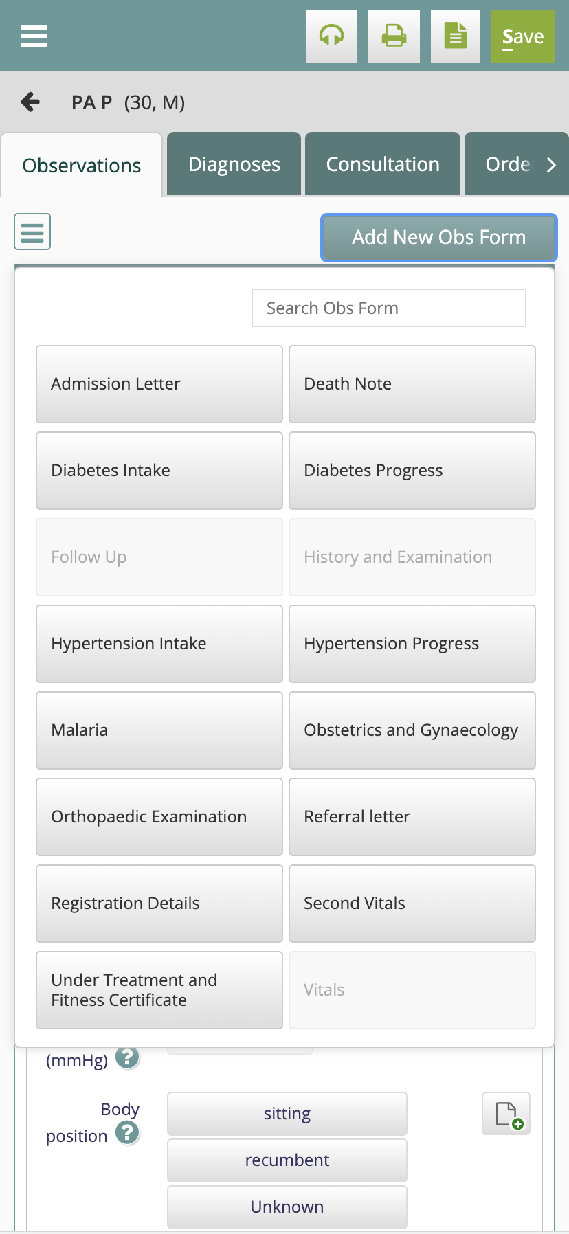
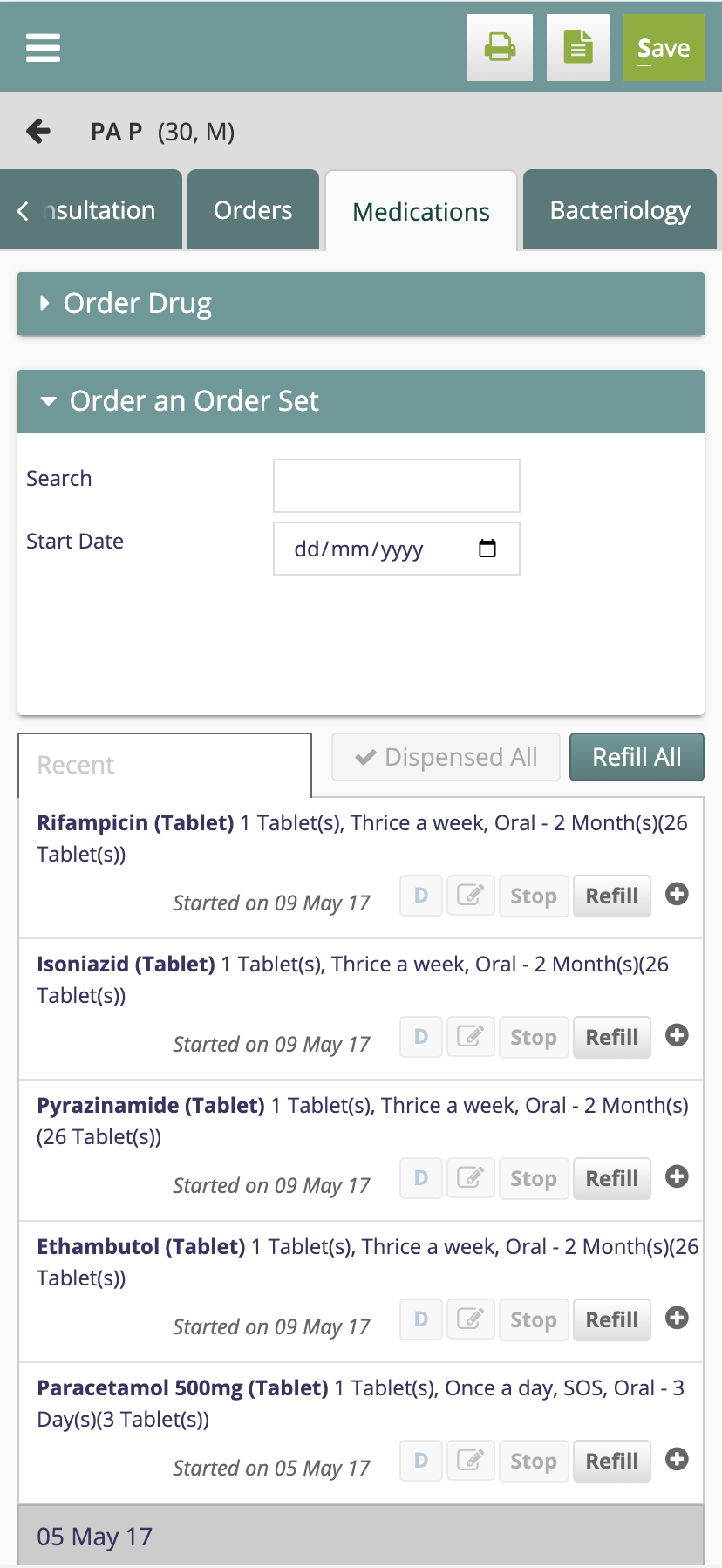
How is it now?
| Panel | ||
|---|---|---|
| ||
Clinical |
| Panel | ||
|---|---|---|
| ||
Registration |
2193 LOC added2193 L
What’s in the future?
OC added
