Add Controls
Yang Zeng (Deactivated)
Angshuman Sarkar
teresa gracias
Purpose and Benefits
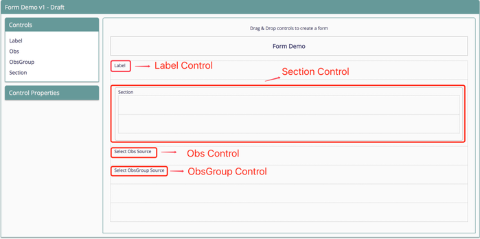
This feature allows implementors to build a form using drag and drop via the UI. For now there are four controls supported which are Label, Section, Obs and ObsGroup. Label and section controls allow implementors to create some labels and groups which are not concept of OpenMRS. On the other hand, Obs and ObsGroup allow implementors to create observations and observation groups which are related to concepts of OpenMRS. This feature also makes it convenient to set the attribute of each observations or observation groups on form builder.
Supported Controls
| Control Name | Purpose | Type | Value | Note |
|---|---|---|---|---|
| Label | At the time of designing a form in Implementer Interface, label control can be dragged and dropped on to the canvas. | text field | Default value can be overridden by double clicking on the dropped control. | In run-time mode, Label Control will be static and none of its properties can be changed. |
| Obs Control | At the time of designing a form in Implementer Interface, Obs control can be dragged and dropped on to the canvas. | Coded, Boolean, Date, DateTime, Text,Numeric, | Default value is the name of the concept the control is associated with but it can be overridden by double clicking on the dropped control. | Control properties can be changed through Property Inspector. |
| Obs Group Control | At the time of designing a form in Implementer Interface, Obs Group control can be dragged and dropped on to the canvas. | -- | Default value is the name of the concept the control is associated with but it can be overridden by double clicking on the dropped control. | Control properties can be changed through Property Inspector. |
| Section Control | At the time of designing a form in Implementer Interface, Section control can be dragged and dropped on to the canvas. | -- | Use section control to make visual groupings of different Obs and Obs group controls on the form. | -- |
Control Properties
Following are the properties supported for the controls.
| Property | Description |
|---|---|
| Mandatory | Marks the field as mandatory if selected |
| Notes | Allows to capture Comments/Additional information |
| Add More | Allows to capture Additional observation for the same control/concept |
| Hide Label | Hides the label of obs Control |
| Abnormal | Set's the abnormal value as true if the observation value is not in valid range |
| Multi Select | Allows to capture multiple values |
| Autocomplete | Displays the control as autocomplete component |
| Dropdown | Displays the control as dropdown |
AllowFutureDates | Allows date value to have future dates |
Each control has its own properties and control properties can be set in the control properties box of form builder. The below table details about the properties supported by each control.
| Control Name | Type | Properties | Default | Comments |
|---|---|---|---|---|
| Obs Control | Text/Boolean |
|
| |
| Obs Control | Numeric |
|
| |
| Obs Control | Coded |
|
| The coded control renders the answers as buttons by default. It can be change to autocomplete or dropdown using the properties |
| Obs Control | Date/Datetime |
|
| |
| Obs Control | Complex(Image/Video) |
|
| |
| Obs Control | Complex(Location) |
|
| URL property is used to fetch all the locations and can be changed accordingly. |
| Obs Control | Complex(Provider) |
|
| URL property is used to fetch all the providers and can be changed accordingly. |
| Obs Group Control |
|
| ||
| Section Control |
|
|
Controls and behaviour not yet supported in Forms 2.0
| Control Name | Purpose | Type | Value | Note |
|---|---|---|---|---|
| Grid Obs Group Control | Show set members in a grid row layout | Grid Layout | Useful to layout answers of the members in grid rows, if the members themselves are of coded answers. | in Forms 1.0, this corresponds to configuring a Concept (set) as { "grid" : true }
|
| Tablular Obs Group Control | Show set members in tabular format, each member groups displayed in a column | Tabular Layout | Useful to layout members side-by-side. For example, if you want to capture and show "Visual acuity" of left and right eye side by side. | in Forms 1.0, this corresponds to configuring a Concept (set) as { "isTabular" : true }
|
| Chief Complaint Control | Capture complaints of patients with duration | Concept class of "Concept Details" | Show chief complaint details in a single row | in Forms 1.0, Concepts with classes "Concept Details" are shown as a single row. |
Steps
1. Select a control
Drag a control from the controls pane and drop it on canvas

Drag a controls on the canvas
2. Select the Obs and ObsGroup source
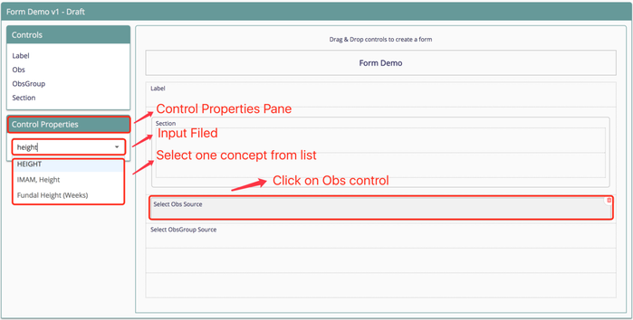
To do this, click on Obs control on the form and a input field will appear below the Control Properties pane. Then input the Concept and select one. For ObsGroup control, follow the same way.
About Obs and ObsGroup Source
Obs sources are all concepts which are not part of a set in OpenMRS.
On the contrary, ObsGroups sources are all concepts which are a set.

Select source for Obs control
3. Rename the Controls
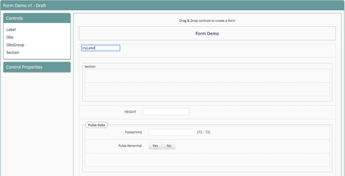
By default the name of the Label control and Section control are "Label" and "Section" respectively. Double click on label to change the name of it. Obs and ObsGroup control are the concept names related with OpenMRS.

Rename a label control
4. Delete a Control
To do this, need to click the control and a trash can icon will show at top-right corner. Then click on the icon and confirm delete the control from canvas.

Delete a label control.
configuring a Concept (set) asOn this Page
Related content
The Bahmni documentation is licensed under Creative Commons Attribution-ShareAlike 4.0 International (CC BY-SA 4.0)